
How to fix WooCommerce checkout drop-off

Most WooCommerce checkouts leak money in places the analytics dashboard never flags. The cart-to-purchase rate looks bad, the team blames traffic, and the actual culprit is a 14-field form on a 3G phone in landscape mode.
WooCommerce checkout optimization is not a single project. It is a small set of moves you sequence, measure, and keep tightening. This is the playbook we run on stores doing real volume.
Why the default WooCommerce checkout leaks
Out of the box, WooCommerce ships a checkout that asks for too much, validates too late, and orders payment methods badly for most markets. Default fields include first name, last name, company, country, street address line 1, line 2, town, county, postcode, phone, email, and order notes. That is twelve required or visible inputs before a card.
Add a generic Stripe form, footer trust badges nobody scrolls to, and a "Place Order" button that fires after a synchronous validation pass, and you get the pattern Baymard has documented for years: long forms are where carts die. Industry benchmark abandonment sits around 70 percent, and field overload is consistently a top driver.
The default is not malicious. It is generic. Generic costs you revenue.
Cut address fields ruthlessly
Start with field reduction. Most stores do not need company, address line 2, county, or order notes for the majority of orders. Hide them by default and offer a small toggle for buyers who genuinely need them.
Use woocommerce_checkout_fields to remove or set required => false on fields that do not gate fulfilment. Combine that with country-specific rules so a Dutch buyer sees postcode and house number, a UK buyer gets postcode-first lookup, and a Malaysian buyer is not asked for a county. Loqate, Postcoder, and Google Place Autocomplete all plug into the billing address in a few hundred lines of code.
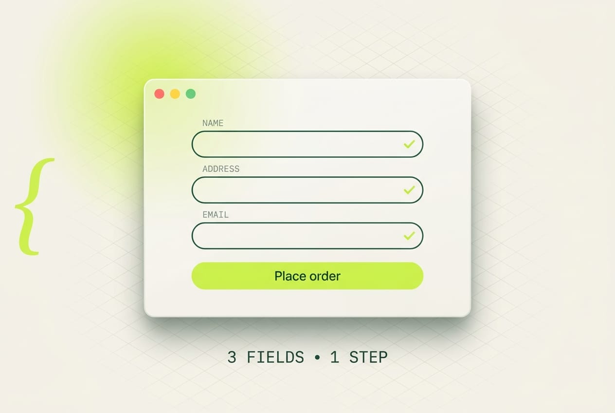
A reasonable default for most stores is six fields above the payment block: email, name, phone, postcode, address, city. Country prefills from IP. Everything else hides behind progressive disclosure.
One page or multi-step
The argument is older than WooCommerce itself, and the answer is product-shaped, not religious.
One-page wins when the average order has 1 to 3 line items, the buyer is logged out, and the price is under a few hundred dollars. The buyer wants the total, shipping cost, and Place Order button visible without scrolling through accordions.
Multi-step wins when the cart is complex (configurators, gift options, B2B quantities), or when you want to capture the email on step one for abandonment recovery before the payment step.
Decision rule: if more than 30 percent of buyers add multiple items and need shipping selection, multi-step usually outperforms because each step has one job. Otherwise default to one page. CheckoutWC and FunnelKit implement both patterns cleanly. The WooCommerce Blocks Checkout (the wc/checkout block) is one-page by design and is mature enough for production on most catalogues.
Guest checkout, account creation later
Forcing account creation before purchase is the single most documented checkout killer. Baymard has flagged it as a top abandonment cause for years.
Allow guest checkout by default. On the thank-you page, offer a one-click "Create your account, your details are already filled in" prompt that sets a password via magic link. WooCommerce supports this with woocommerce_enable_guest_checkout plus a small post-purchase template. Convert the order first, the account second.
Payment method ordering by market
The fastest WooCommerce checkout win for European and Asian stores is putting the local payment method first. Card-first defaults made sense in 2014. They cost orders today.
For the Netherlands, iDEAL converts at rates card never matches. Put it first, with the bank picker visible inline, not behind a dropdown that triggers on selection. Mollie and Stripe both support iDEAL with the iDEAL Payment Element pre-rendering the bank list.
For Malaysia, FPX comes first for desktop, GrabPay and Touch n Go eWallet for mobile. Stripe and iPay88 both cover this; pick based on settlement speed and your acquirer.
For mobile traffic anywhere, Apple Pay and Google Pay belong above the manual card form. Stripe Payment Request Button or the Payment Element handles wallet detection automatically. Show the wallet button only if the device supports it; do not render a dead Apple Pay button on Android.
Speed at checkout
Checkout pages get bloated because everyone treats them like another product page. They are not. Strip them down.
Defer Stripe Elements until the payment block enters the viewport, or until the user interacts with the address form. Stripe.js is around 60 KB gzipped and pulls a second iframe; loading it on initial paint costs LCP for no reason. The stripe.elements() call can wait.
Server-render the order summary. Do not call wc-ajax=update_order_review on every keystroke; debounce to blur or to explicit commits. Remove plugins that hook synchronous AJAX into woocommerce_review_order_before_submit. Inspect the network tab on a live checkout. Anything blocking is a candidate for deletion or async loading.
Cache cart fragments correctly. The default wc-cart-fragments script is one of the most common culprits behind a slow first paint on Woo stores. Migrate to the Cart Block (which uses the Store API and is far lighter) or dequeue the script on pages that do not need a mini-cart.
Validation that respects the user
Validate inline, on blur, with the message next to the field. Never wait until the user clicks Place Order to surface the email typo from three minutes ago. The Place Order error state is the single most rage-inducing pattern in checkout UX, because the user has already made the cognitive commitment to leave.
Use the checkValidity() API and pair it with field-level handlers. For postcodes and phone numbers, validate format on blur and content on submit. For card details, Stripe Payment Element handles this for you; use it instead of building card fields manually.

Trust signals where the eye lands
The eye lands on the Place Order button at the moment of decision. That is where trust signals belong.
Place a small row beneath the button: secure-payment lock with the actual processor name (Stripe, Mollie), a one-line return policy, a delivery estimate ("Ships in 2 business days from Amsterdam"). Skip the trust badge mosaic in the footer. Nobody reaches it.
If you have real reviews, surface a single one above the order summary, not a carousel. Keep the noise down at the moment of payment.
Mobile-specific moves
Mobile is where most stores lose the order. The fixes are unglamorous and they work.
Tap targets at minimum 44 by 44 CSS pixels. Place Order button full width, sticky at the bottom on mobile, with a safe-area inset on iOS so the home indicator does not eat clicks. Test on a real iPhone with iOS Safari, not only Chrome desktop responsive mode. iOS has a long-running quirk where position: sticky inside a transformed parent breaks silently.
Set autocomplete attributes correctly: email, tel, given-name, family-name, postal-code, street-address, country, cc-number, cc-exp, cc-csc. iOS and Android both autofill from saved profiles when these are right. Many themes strip them or set them to off. Audit your form once and you will recover real conversion.
Numeric inputs need inputmode="numeric" for postcodes and phone, and autocomplete="one-time-code" for the SMS verification field if you use 3D Secure SMS fallback.
The funnel: GA4 and where it leaks
You cannot fix what you cannot see. Wire up the four-step ecommerce funnel in GA4 properly:
view_cartwhen the cart page loads.begin_checkouton checkout page entry.add_payment_infoon payment-method selection.purchaseon order completion.
WooCommerce's Google Analytics for WooCommerce extension fires these natively for the Blocks Checkout. If you are on shortcode checkout, you will need a small dataLayer push, or use Google Tag Manager with a Woo template.
The leak is almost always between begin_checkout and add_payment_info. That is the address-field stretch. If your gap there is wider than 35 percent, fix the form before you touch anything else. If the leak is between add_payment_info and purchase, you have a payment-method or 3DS problem; check decline rates and SCA challenge frequency.
What we ship in a checkout audit
We run this as a fixed-scope engagement: audit of the live checkout, GA4 funnel review, mobile and Lighthouse measurement, a prioritised change list ranked by expected lift, and implementation of the top five. For most stores, those five cover address-field reduction, payment method order, Stripe Element deferral, mobile sticky CTA, and validation UX.
If your store has real volume and the checkout has not been touched since launch, you are leaving orders on the table. Book a checkout audit and we will tell you in writing what is costing you orders and what we will change. For the wider conversion picture, 5 WooCommerce changes that doubled a client's conversion rate is the long-form companion to this post.